I heard skyscrapers were invented to look cool at the top and sucky at the bottom so you can only appreciate them if you're a rich fuck. I'm going to rate them by how irritatingly procapitalist they are as well as how ugly and morally reprehensible they are (in other ways). If you want to see what a GOOD skyscraper looks like, check out my article on the 8 best skyscrapers in Charlotte, NC. I am NOT including the Flatiron Building, it's not a fucking skyscraper, if there was a separate place on this list for things that are overrated as far as "being skyscrapers" the Flatiron Building would be RIGHT on top. IT IS ONLY 22 STORIES TALL. This article will also not include buildings I just straight up love, like the Radiator Building (unfortunately not really a skyscraper anyway), the Met Life Building, and the Woolworth Building.
8. Met Life Tower

The Met Life Tower is seriously not that overrated. It's pretty cool, it ALMOST has a Brutalist thing going on. I do feel like it's kind of self-important to light up the entire top bit to "symbolize eternal light." I'm also subtracting points because the lower part which is just a normal building isn't very cool, and also because it looks kind of British.
7. 30 Rockefeller Plaza

I am so sick of seeing the words "gorgeous Art Deco" in reference to these mediocre buildings. If I see one more Gorgeous Art Deco Skyscraper I'm gonna flip out. This building is okay, it's fine, aesthetically, it's FINE. But it's overrated because some people are just too easy to please. I'm pretty fond of the superstructure but without any ornamentation the whole building is kind of a drag.
6. The Gehry Building

When I looked at this building up close I was like, hell yeah! I can dig these woogles! I respect the architect for that attention to detail. However. From far away it looks extremely unpleasant. Unlike a lot of Gehry's other buildings, there's no interesting total structure, no pleasing shape, the decision to make it entirely out of brushed steel was a hideously bad one, and the waves that are cool up close make it look kind of like scrap metal from far away. Ultimately this one's bad because I hate the building material and its postmodernist associations so much.
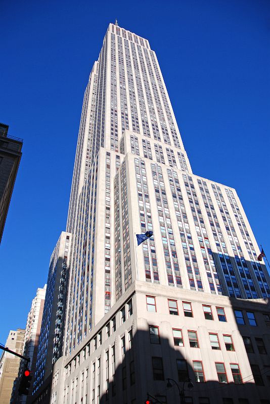
5. The Empire State Building

The Empire State Building is one of the less aesthetically overrated famous skyscrapers in New York City. It has a cool chunky thing going on and it kind of manages to make it work how much it looks like a prison. I like what appears to be red molding around some of the windows. However, even the top bit looks like ass. I assume this is why it's not that overrated, everyone can just see that it's ugly, even rich people. But I appreciate that it has an interesting 3D structure, and the windows are ordered in a sort of pleasing way. Minus points for the fucking "empire state," yeesh. I keep wanting to move this down the list because it's so ugly but everything below it is even worse.
4. One World Trade Center

I don't actually know if anyone likes this building so I couldn't say whether it is overrated but just look at it. It makes me furious. "So what should our new iconic skyscraper that represents standing bravely against countries we've been destroying for decades look like?" "Uhh just slap some triangles on it. If we give it a mirrored facade we won't have to like, design anything." Ugh the fucking Star Wars laser mast at the top is kinda cool though.
3. New York Life Building

Listen, I love Gothic architecture. I might even like Neogothic architecture (but I hate Neogothic fonts). But this building's attitude I cannot countenance. I look at it and it annoys me. It's like a building that inexplicably needs a lot of room between its legs on the subway. And also!! The aspect ratio is bad! This building is too wide for how tall it is, in every distinct segment. This could be very easily fixed by respacing the windows, I think. But man the New York Life Building looks evil. It looks like it wants to kill me personally (for my life insurance policy?? joke's on you, I don't have one). And did you hear the golden pyramid has over 25,000 gold leaf tiles?? Shit's unethical.
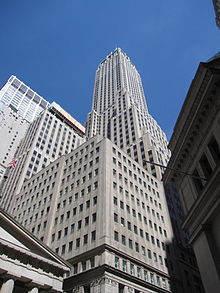
2. 40 Wall St.

I'm intentionally not using a picture that shows the green roof. Fuck the green roof. Do you think you're fucking cute? This building manages to take everything I said about window divisions and make it look like irrelevant bullshit, plus the larger 3D structure is a fucking mess. The top of this building almost has an architectural style, but the rest doesn't. This building's only claim to fame is that it got its ass pathetically kicked by the people building the Chrysler Building through espionage or whatever for a dick measuring contest.
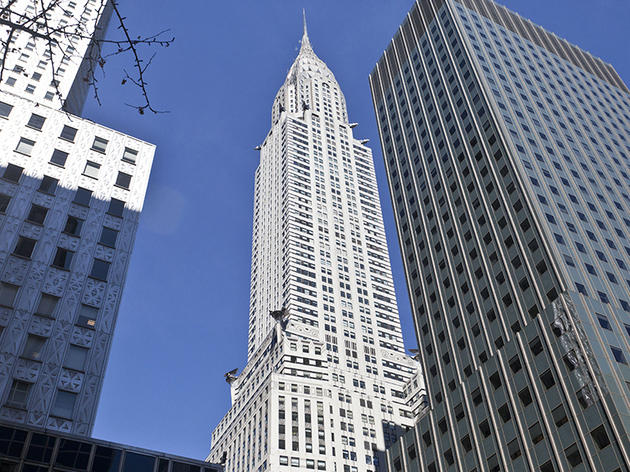
1. The Chrysler Building

The Chrysler Building is easily one of the most iconic skyscrapers in New York City. And if you look at just the top bit with the art deco shit it's pretty cute! It's got those grotesques superheros love to perch on? But the rest of the building is a fucking eyesore. The white facade actually makes the windows uglier and more glaring, and there's no real design to the structure that could save it. I think it could be improved with some dividers for the different sections of windows. Maybe some ledges. ANY kind of designs on the facade, or like some chunky superstructure. ANYTHING. Fuck the Chrysler Building.